Unfortunately if that was shrunk down to an emoji size it would just look like a dirty yellow dot and I don't think anyone would be able to see what it actually is. But it's a good start! Needs massive simplification.I don't know how to adjust size. But if you tell me how I can keep looking and try.
-
Biblical Families is not a dating website. It is a forum to discuss issues relating to marriage and the Bible, and to offer guidance and support, not to find a wife. Click here for more information.
You are using an out of date browser. It may not display this or other websites correctly.
You should upgrade or use an alternative browser.
You should upgrade or use an alternative browser.
Upgraded to XenForo 2.2!
- Thread starter nathan
- Start date
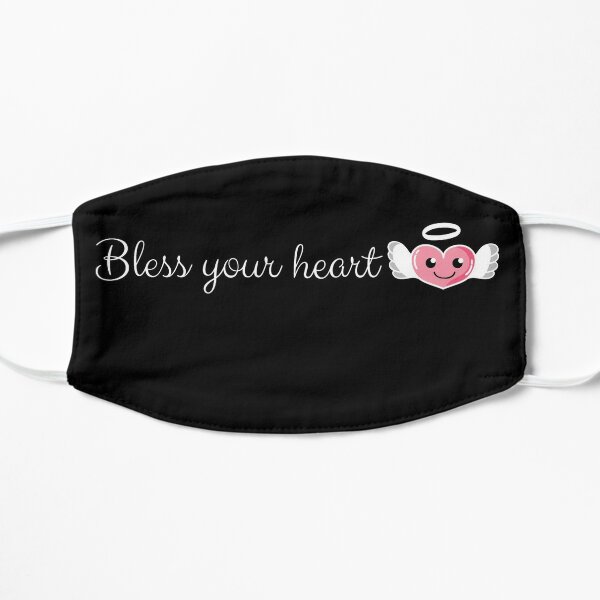
Maybe the wee image on this mask would be better:

 www.redbubble.com

Bless Your Heart Emoji Mask by shaheerahs
As we say in the south...bless your heart! Hope this cute design makes you smile. • Millions of unique designs by independent artists. Find your thing.
NOW we're talkin'!!So what you're saying is a "bless your heart" emoji
Main forum list. Up the top under where it says 'chat' you can click on 'mark forums read'.Before upgrade when checking "What's new?" I could remove all unread posts with one button. How can I do same here?
How do I bring up the bullet-point or numbering options?
OK, now those are showing up by the Paragraph symbol, but I'm not getting the right, center and left justifying options (never use them, though)
Hi frederick, do you not see a "Stay logged in" checkbox, when you are signing in? Should be right below the password.It's still logging me off when I use my PC. My phone is good tho.
Yes, I've checked, unchecked, and rechecked it several times but still getting logged off.Hi frederick, do you not see a "Stay logged in" checkbox, when you are signing in? Should be right below the password.
Alignment is its own dropdown menu just to the left of the Paragraph symbol.OK, now those are showing up by the Paragraph symbol, but I'm not getting the right, center and left justifying options (never use them, though)
Having said that, there are four different toolbar layouts depending on the width of your screen. If you still have questions about this, post a screenshot of what you're actually seeing then I'll know which one you're talking about. Narrower screens do give slightly fewer options to reduce clutter, but if any important options are missing I can edit the toolbar and put them back in.
No need; thanks for adding in the numbering and bulleting on the More options . . . drop-down for the width of my windows!Alignment is its own dropdown menu just to the left of the Paragraph symbol.
Having said that, there are four different toolbar layouts depending on the width of your screen. If you still have questions about this, post a screenshot of what you're actually seeing then I'll know which one you're talking about. Narrower screens do give slightly fewer options to reduce clutter, but if any important options are missing I can edit the toolbar and put them back in.

