• Biblical Families is not a dating website. It is a forum to discuss issues relating to marriage and the Bible, and to offer guidance and support, not to find a wife. Click here for more information.

BF Logo

FollowingHim

Administrator
Staff member
Real Person
Male
We are gradually working on website and forum upgrades, and one thing we would like to upgrade is the site logo. The current logo is very recognisable and illustrates a lot, but is complex, doesn't scale well, and looks a bit cheezy too. We're looking for something cleaner and more modern, and are very keen on hearing any comments or suggestions.

Option 1: Current logo, in various versions as you'll see around the current website:
logo2.png

BFlogo.png

logo_sm.png
 
Option 2: This is designed to look good on a black background (there's a reason for that, but I can't disclose more right now!), or on a white background on printed material, to print well in black & white, to scale better through being simpler, and to look clean and modern, while retaining the same "brand" we've always had so it is instantly recognisable as the Biblical Families logo.
 

Attachments

  • BFlogoworking2small.png
    BFlogoworking2small.png
    9.9 KB · Views: 106
  • BFlogoworking3small.png
    BFlogoworking3small.png
    13.3 KB · Views: 106
  • BFlogoworking2verysmall.png
    BFlogoworking2verysmall.png
    1.4 KB · Views: 106
What do you think?
- Black & white vs colour in different uses (online, print etc)?
- Any suggested changes to layout?
- Any more radical redesigns or new ideas?
 
I'm rubbish for creativity that is also constructive.

Therefore, here is my humble submission.
 

Attachments

  • 2tim.png
    2tim.png
    12 KB · Views: 104
Wish I could "like" that post - one day in the future I will be able to, watch this space...

Also, ideas on how to represent something vaguely like the BF logo in the tiny 16x16 logo space you get at the side of a browser tab would be awesome. It's extremely difficult. Here's my first crack at
- A happy family that tiny, and
- The BF "house" logo in miniature.
Excuse the horrible colours used in my experimentation.
 

Attachments

  • tinylogo1.png
    tinylogo1.png
    318 bytes · Views: 101
  • tinylogo4.png
    tinylogo4.png
    278 bytes · Views: 100
I recall somewhere a poly umbrella pic. Maybe work from that since it's monogamous version is known in church circles.

Sent from my SM-G900V using Tapatalk
 
Both of the black and white ones look good to me.
I would assume that they could be used interchangeably, depending on the background.

Rereading, I guess that is what you were meaning by what you said?
 
Yes, the point is that they'd be interchangeable - white on black for some purposes (e.g. websites if a black background is used), black on white for others (e.g. printed handouts, booklets, fliers).
 
I like the monochrome. it does have cleaner, more defined lines. I see using that on the majority of the site that might get printed out at home/work/etc. But I also like the full color version and think we should keep it for the brochures.
 
Would the B&W version I present above, but with the people coloured in, be a suitable full colour version for use in such situations? I am just trying to achieve as much consistency as possible. It would be far better to have a single logo that was black, white or colourful depending on the medium, rather than two different logos.

If you don't think that would be suitable, how would the b&w logo need to be altered to be able to be used in a coloured form also?
 
Personally I think the B&W logo is far superior and much less dated. Deriving an icon sized logo gives me an idea, but I don't have time to make it before work. Will do so after.


Sent from my iPhone using Tapatalk
 
Here's a rough sketch of something I think could work well:
 

Attachments

  • BF-family-circle-1.png
    BF-family-circle-1.png
    19.4 KB · Views: 64
I think this idea could be made to read well at small sizes, either complete or cropped. And as a favicon an image doesn't necessarily have to be very low-res; a single .ico file can include versions ranging from 16-by-16 pixels up to 64-by-64.
 

Attachments

  • BF-family-circle-1-small.png
    BF-family-circle-1-small.png
    7.3 KB · Views: 64
  • BF-family-circle-1-favicon.png
    BF-family-circle-1-favicon.png
    4.1 KB · Views: 63
This is a stock pic I've had floating around on my computer, I don't remember where I got it. Personally I like the baby. OTOH, I don't really have an opinion of the logo. As long as it isn't pink.
 

Attachments

  • stock-illustration-16763067-unorthodox-families.jpg
    stock-illustration-16763067-unorthodox-families.jpg
    17.8 KB · Views: 60
I'm curious to see what the "poly umbrella pic" is that TLS spoke of

Otherwise i think the one slumberfreeze submitted may be the most correct, lol.

Mystic has a unique concept too that is interesting, but i agree black/white seems better and more modern.

Is the structure behind the family supposed to signal a home or a church? I thought it was interesting if it was supposed to be a church, do most poly families on here home church?
 
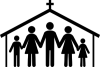
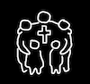
Moxy, as I see the building, it is signifying several things at once:
- A home, so this is a family living together
- A church, with the home / family being the fundamental unit of the church
- It gives an opportunity to add a symbol that makes it very obviously Christian (a cross on a roof)

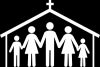
Mystic, your suggestion does compact it well and illustrate family & church using fewer lines, I do like that.
However I don't like that they're all forming a circle around a cross, because it looks like they're worshiping the cross, and I don't like the connotations of that personally. The cross is a useful motif that says "Christian" to most readers, so is very good to include somewhere - the fish sign would also work but is less recognised. Having it up on the peak of a roof above the family means it is essentially just a label hanging over their heads saying "this family follows Christ", which is reasonable. But having the family all holding hands around it is an image that would turn away too many deep-thinking people. It just opens a can of worms that I'd prefer to steer completely clear of, and stick with a logo that is as uncontroversial as possible. The roof makes the cross not the focal point of the family, so it is as neutral as possible - including the cross for illustrative purposes and the sake of those who feel it is a critical symbol, but not focusing on it for the sake of those who feel it is a pagan icon.

I like the baby too Eristophanes. I actually found a simpler and more scalable way of representing a baby in another stock image and considered including it, but decided against it because the logo was already complex enough. But it is a nice touch that could certainly be added.
 
Mystic, my first thought on looking at your picture was that it's not obvious they are women. This could be 3 men, or 2 men and a woman. That's something we need to be super clear on with the amount of transgender/group marriage nonsense that's going on now days.
 
Stock photo with a woman holding a very simple baby (as mentioned above), could easily add this sort of thing to the logo but only if it wouldn't complicate it too much.
 
Okay, here's basically what I was thinking of for the mini view. My first thought was too similar to the Westinghouse logo, so this is basically just a small part of the main new logo proposal with a bit more black. Another option is basically a stylized W with the three dots representing heads. Though like I said, that's similar to the Westinghouse logo.
 

Attachments

  • BFminiProposal.png
    BFminiProposal.png
    4.5 KB · Views: 42
I love Mystic's offering. It's everything you are looking for and very artistic, simple and down to earth to boot. I have never liked the bathroom silhouette people because they make me think about people going to the bathroom.
 
Back
Top